Reto Men's Barber Shop Signage

Barber Shop Leaflet RGB Update
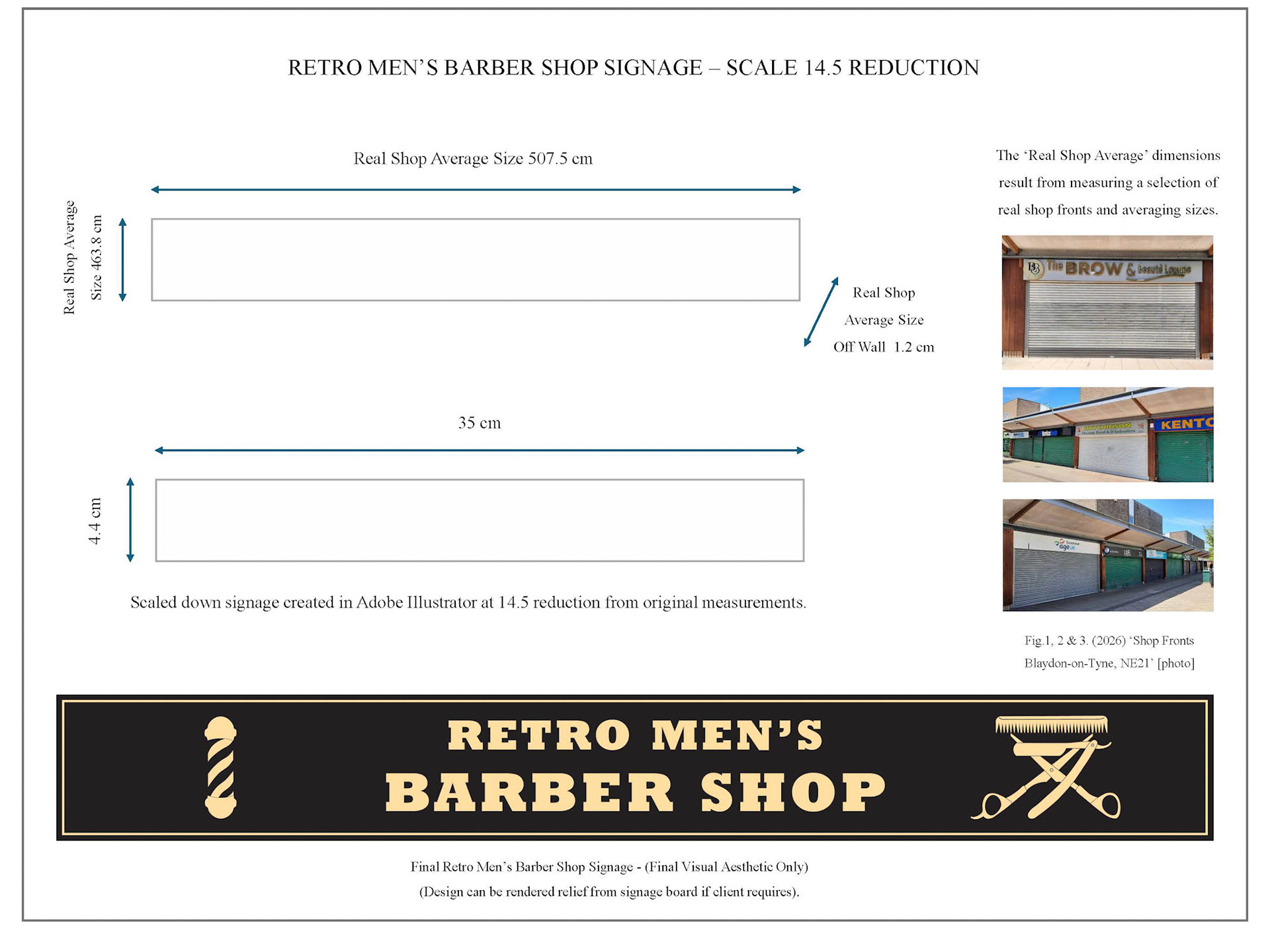
SIGNAGE & LEAFLET/FLYER
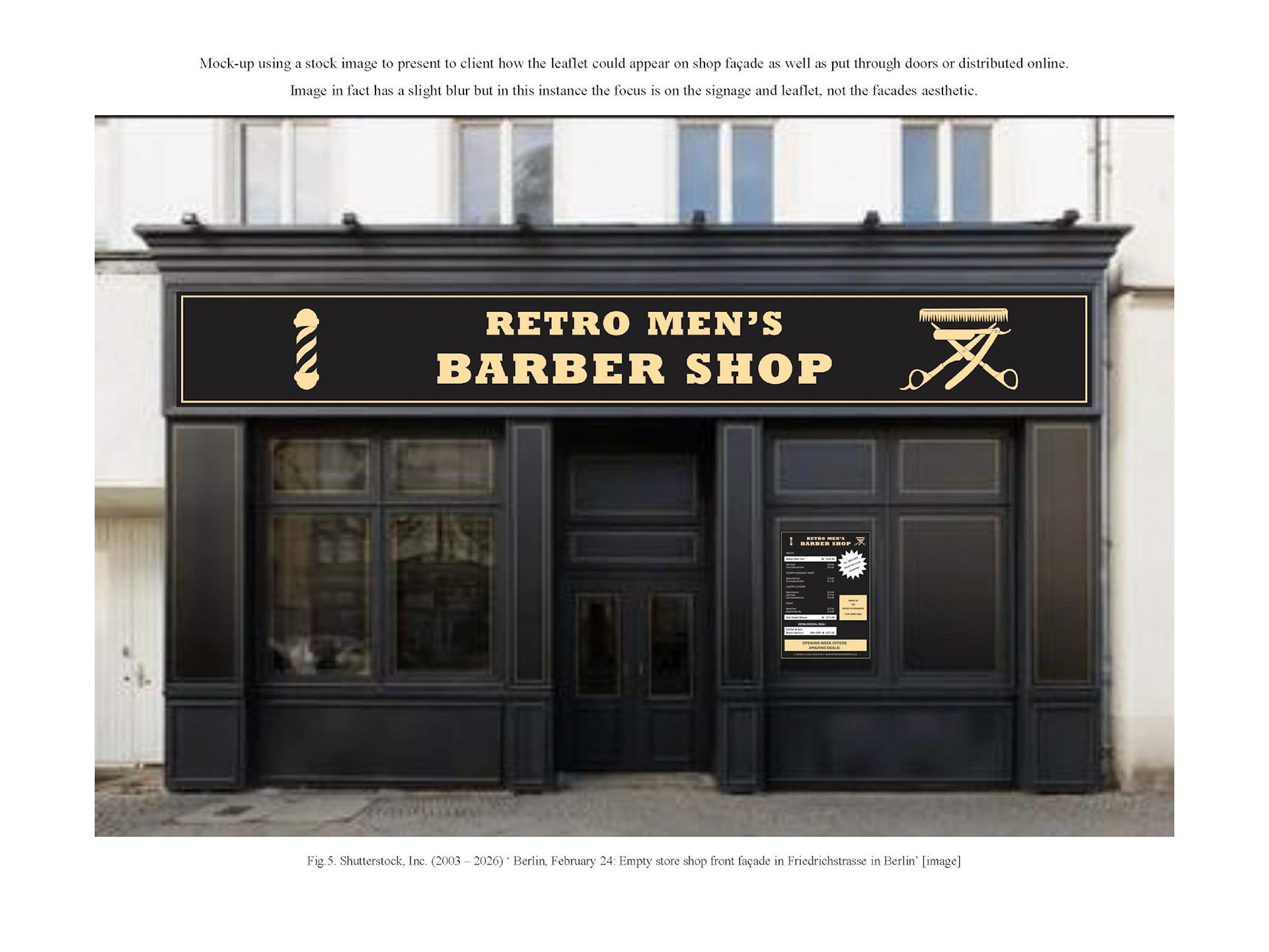
PG Diploma Assignment: Store front signage & flyer for 'Retro Men’s Barber Shop', a fictional vintage yet modern and trendy barber shop. The leaflet/flyer to be both printed and distributed digitally.
Created with a combination of Hand-drawn elements, Adobe Photoshop and Illustrator.
The design work utilises balance through illustration and typography, black negative space, a bold Rockwell Nova typeface along with the Aptos font family. The black and pale gold colour palette bringing homage to both barber shop history and contemporary society, whilst the white allows launch day offers that extra pop and readability.
MAGAZINE COVER DESIGN
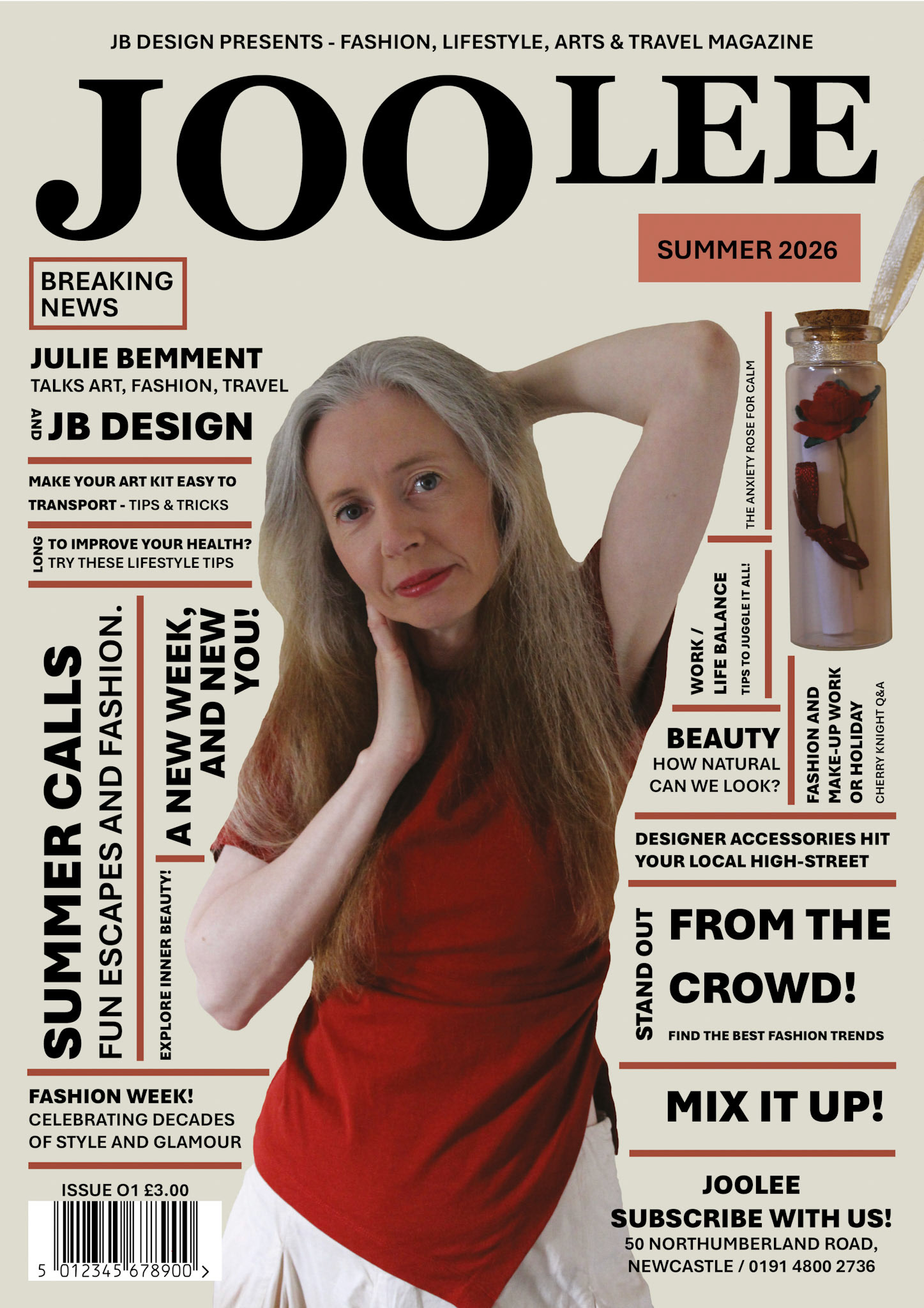
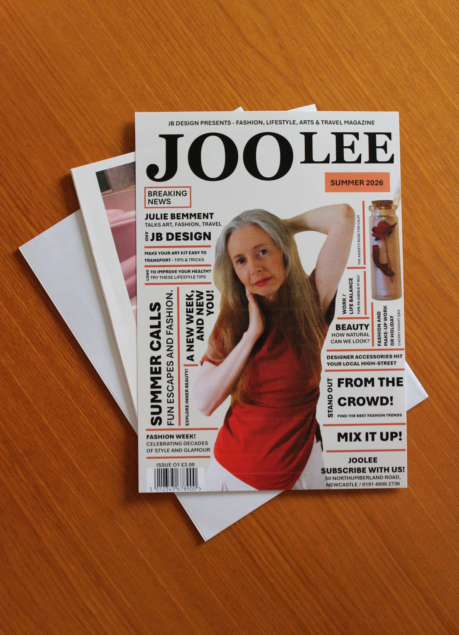
PG Diploma Assignment: Magazine cover design focused on fashion, lifestyle, arts and travel, inspired by Graphic Designer Paula Scher’s Public Theatre posters from the 1990’s.
Title and colour palette inspired by my own name, website and CV.
The design utilises the ‘rule of thirds’, balance through typography and imagery alike. The model as myself, being the central focal point. Negative space giving greater visual power to the title and representing a resting space for the reader.
Typefaces Georgia and Aptos complimenting photographic imagery and design theme. Georgia reflecting my own corporate identity, whilst Aptos, visually simple and representing Scher’s idea’s of city streets.
LANDMARK POSTCARD DESIGN
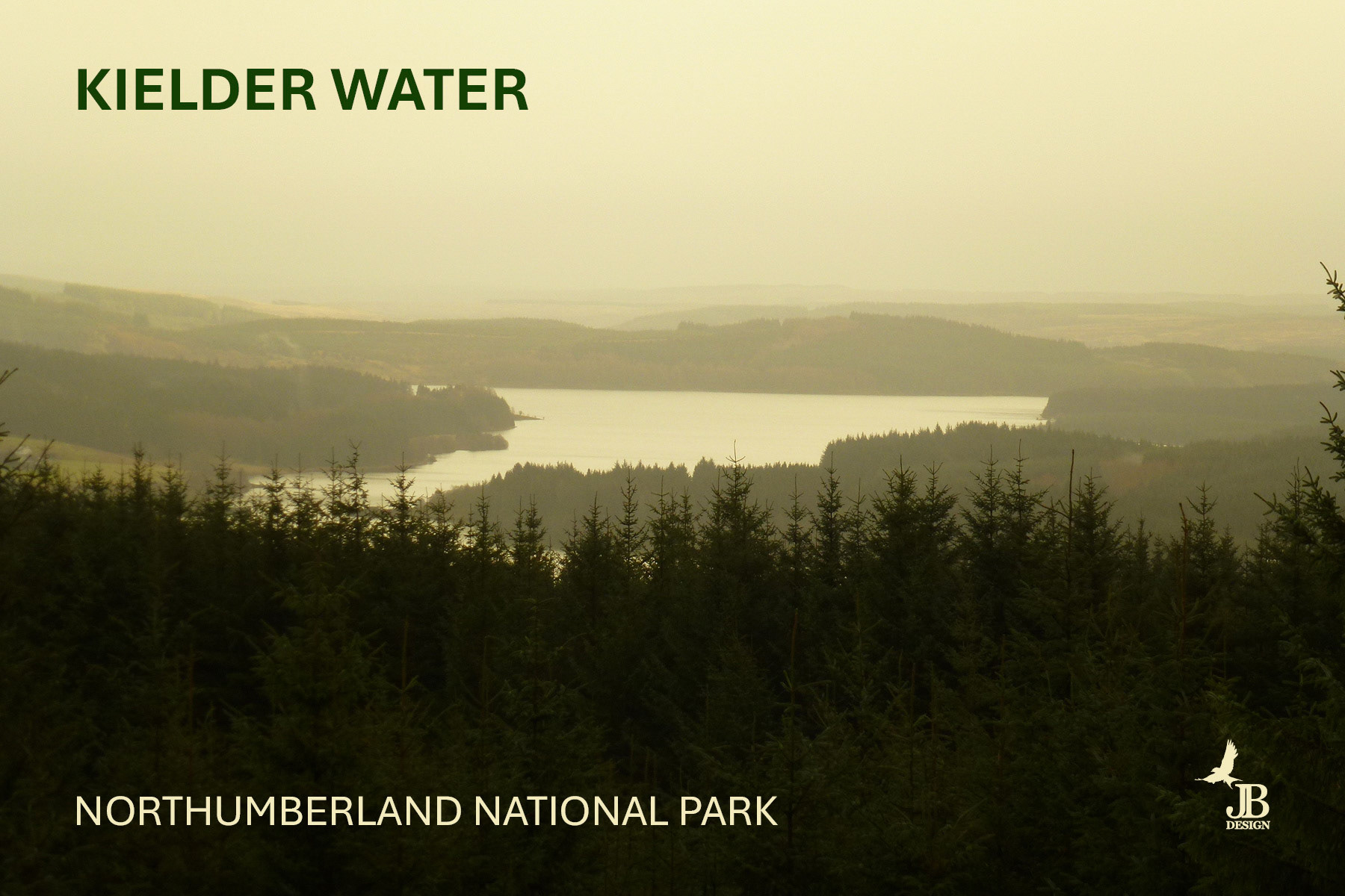
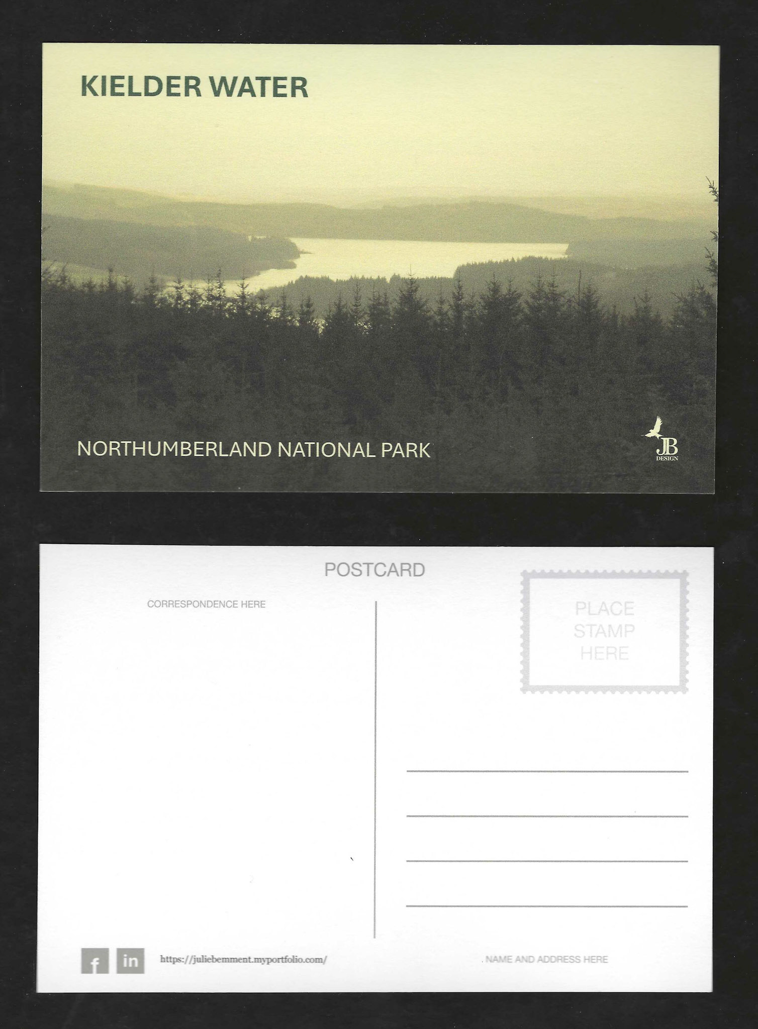
PG Diploma Assignment: Postcard design inspired by a landmark situated in my local area of North East England. Kielder Water, Northumberland. Photograph taken half-way up a 45-minute walk to Kielder Observatory, also known as Dark Skies. The reservoir holds a capacity of 200 billion litres of water and is Europe’s largest man-made lake.
The design utilises the ‘rule of thirds’, balance through typography and imagery alike, and Kielder Water being the central focal point.
Typeface Aptos and Aptos Bold compliments the photographic imagery and design theme, whilst the back of the postcard uses the standardized postcard Helvetica font, and Georgia, reflecting my own corporate identity.